This article is contributed. See the original author and article here.
We are thrilled to announce the General Availability (GA) of the new User Experience (UX) in our Field Service Mobile (FSM) application! We heard your feedback during the preview period and are excited to mark this milestone with key enhancements and changes!
When we started this journey, our goal was to deliver an intuitive, modern user experience for frontline workers to streamline workflows and increase user satisfaction. We reduced the number of clicks taken by technicians to accomplish tasks in the app and enabled access to rich step by step instructions for troubleshooting. At Ignite, we announced the addition of Copilot capabilities to help technicians prepare for and document work easily, through Copilot Work Order Summarize and Update. Now, with GA, we have added several admin controls to allow for progressive enablement, new enhancements to the agenda and lists, and several performance and reliability improvements. Read on to learn the details!
GA Highlights of the New UX
1. Updated Agenda view with easy Copilot access
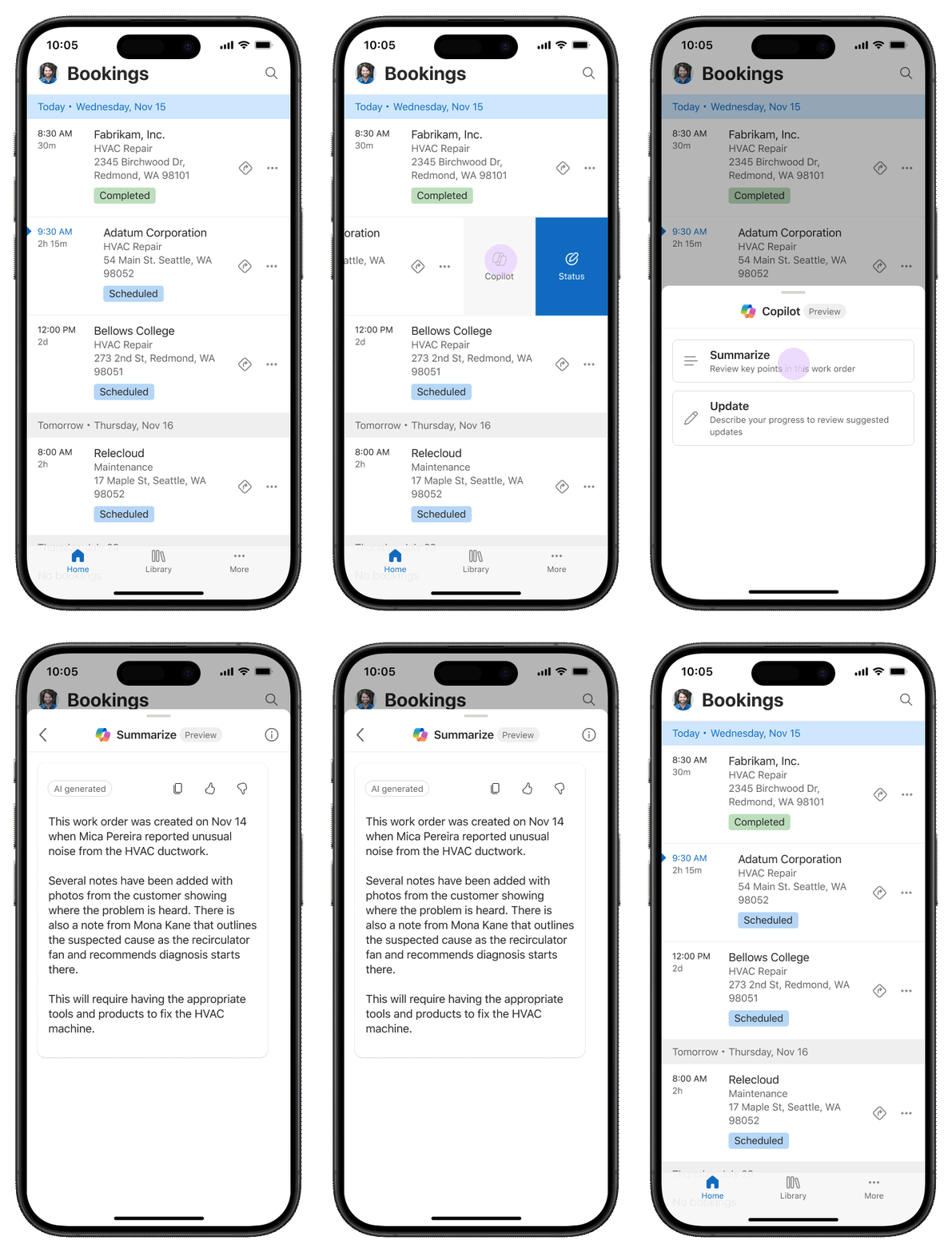
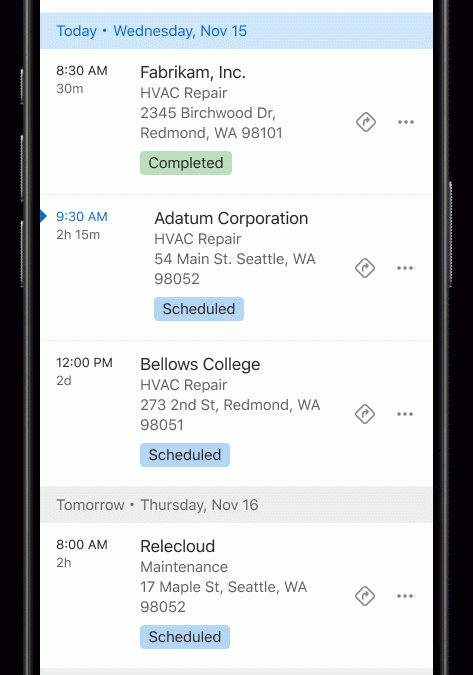
Customers loved the new Agenda experience in preview, which offers intuitive access for service technicians to view and update their bookings, featuring several handy shortcuts. In the GA version, we have introduced several enhancements. These include infinite bidirectional scrolling for quick access to past or future bookings, and visual updates to make it easier to distinguish between different statuses and bookings. Technicians need key information at their fingertips while on the job. Now, makers can customize and display additional information on the agenda based on specific scenarios. Lastly, Copilot (Preview) is now accessible on every booking. All it takes is a simple swipe gesture, allowing technicians to easily summarize or update a work order.

2. Modern configurable lists on mobile
Users spend a lot of time reviewing data in lists (or grids). We’re excited to announce all top-level lists in the mobile app are now part of the new UX – with the ability to configure and display 10 columns per row! With additional at-a-glance information available right in the list, users can avoid navigating into the form, improving clicks to complete the job and perceived performance. The new lists control also supports searching, sorting and landscape and portrait modes (which our tablet users love)!
3. Admin controls for progressive enablement
A key preview ask from makers was enabling gradual deployment of the new UX for their workforce for effective change management. We heard and delivered! The new UX for technicians works in the existing FSM app (no new app installs, or migration needed). Via the new FSM settings page, makers can quickly deploy this to a pilot group of users using security roles. And makers can turn on or off specific features such Copilot based on their organizational requirements.
4. Additional user settings
Besides look , feel, and navigation enhancements, users can also update their time zone and language settings within the app. They can also select their preferred maps app to use for navigation.
5. Fundamentals
Most importantly, with this release we’ve greatly enhanced performance and reliability of all new features. Whether scrolling in various lists to handling issues with actionable error messages, we’ve ensured users have a robust and delightful experience.
Closing thoughts
As with any technical milestone, we must also callout things that lie ahead of us. We’re looking forward to releasing the view selector inside the list control for users with multiple views. The Guides and Copilot features accessible from the new UX continue to be in preview (and can be turned off if desired).
As part of this GA, we are discontinuing the streamlined booking experience introduced during preview. Form-based experiences will continue to leverage the classic UCI experience in the app, which supports layout and business logic customization. And at present, users enabled for the offline mode will be taken directly to the classic UCI experience as well.
The launch of the new UX in Field Service Mobile marks a significant milestone in our mission to deliver the best tools and technology for frontline workers. We are confident that these innovative features and user-centric design will greatly enhance your daily operations, making your work more efficient and enjoyable.
Enable these features today and share your thoughts with us! We eagerly await your feedback and stay tuned for more updates!
The post Announcing the General Availability of the New UX in Field Service Mobile appeared first on Microsoft Dynamics 365 Blog.
Brought to you by Dr. Ware, Microsoft Office 365 Silver Partner, Charleston SC.


Recent Comments