This article is contributed. See the original author and article here.
I’ve been talking to customers about migrating to Azure for a while now and I’m passionate about talking about the Discovery part of your migration project. The part where you look at your existing environment and collect data on it. Data that helps you see what you have in your environment, how everything is interconnected, even getting down to the deep dive of what patches are applied to your operating systems, all that data. Collecting all that data is important and can really set you up for a successful migration.
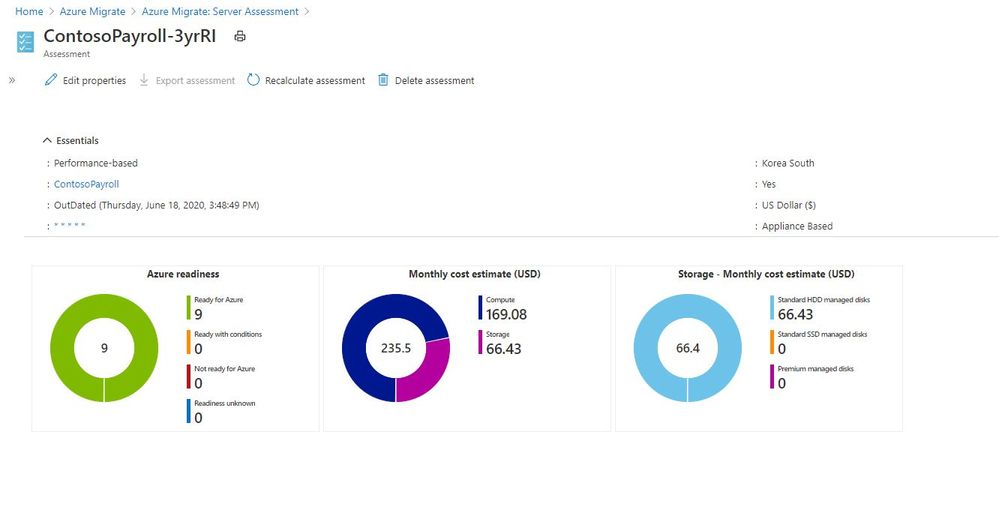
However, the trick with collecting all this data is being able to display it and interpret it. If you’ve been using Azure Migrate to collect that data, we’ve had some great reports and outputs from it to help us visual the data and interpret it.
 Azure Migrate Report
But the thing with analysing data, everyone likes to see it that bit differently. And the Azure Migrate team have a new offering, in the form of PowerBI templates you can now use to visualise the data slightly differently. They’ve also released some PowerShell Modules to help interact with REST APIs to help you pull out the data to use within PowerBI.
PowerBI Assessment Utility
The first PowerBI and PowerShell Module that they’ve released is called the Assessment Utility. This utility is designed to compliment the Azure Migrate: Server Assessment solution. Currently you can go into the Azure Portal and create a group of machines, and assessments for those group, then compare costs based on things like sizing, Reserved Instance, Hybrid benefits, etc this new utility helps to automate those activities and visualise the cost estimates across multiple assessments. With this new utility the PowerShell script creates 12 different assessments using combinations of sizing criteria, Reserved Instances and Hybrid benefits, that can then be visualised within PowerBI.
You can find the documentation on how to use this new utility here.
The data being viewed in this PowerBI report is the same data within Azure Migrate, just in another format. This view is giving you an at a glance view of what your server estate looks like in terms of operating systems within it and also things like Average CPU usage across those servers.
With the quick glance data regarding your operating system estate you can easily see what servers are candidates for upgrade or modernisation or in the case of Windows Server 2008 the opportunity to migrate to Azure and give yourself more time to plan for the future or give these servers a bit more life while still receiving security patches.
Having data such as the average utilsation view across your estate gives you an indication on how much optimisation and saving opportunities you have, and hopefully a great insight into why you should consider running a performance based right sizing report using Azure Migrate before migrating.
Dependency Mapping
Dependency mapping or understanding how all your existing servers and workloads interact is really important when you are thinking about migrating your workloads to the cloud or anywhere else to be honest. You need to know what will be affect if you move a server somewhere else, what relies on that, what requires fast latency, etc etc, the consequences go on.
Digging into this kind of information gathering and then analysis can be time consuming, but it’s one of those steps that are totally worth it. I’ve seen customers uncover dependencies they didn’t know about because documentation and communication within their departments hasn’t been great or colleagues have put in something temporarily and it’s become a production workload.
When you use Azure Migrate: Server Assessment dependency analysis you can visualise the data and interact with the data there. However, this new PowerBI template gives you another option to help visualise the data and interrogate it.
The team have also released a PowerShell module that goes along with this new PowerBI visual, which can help you get a list of discovered VMware machines and enable or disable dependency analysis on a large number of machines.
If you are working on a migration project or even just looking to gather more information about your environment give these new tools a go and let us know your feedback!
Brought to you by Dr. Ware, Microsoft Office 365 Silver Partner, Charleston SC.


Recent Comments