This article is contributed. See the original author and article here.
This post was authored by Stacia Varga, business intelligence practitioner, author, mentor, and classroom instructor.
As organizations adopt cloud data lakehouses to deliver the best of breed capabilities of data warehouses and data lakes, non-technical users such as data analysts don’t always have an easy way to access the data lakehouse for exploratory analysis. On the other hand, Databricks SQL enables quick access to data insights by enabling BI/SQL workloads in the lakehouse. For those organizations having a well-established Microsoft Power BI center of excellence, Databricks SQL also integrates with Power BI to support queries of the most complete and recent data in the data lake. Before looking at the integration with Power BI, let’s look at the capabilities of Databricks SQL.
Databricks SQL allows you to easily apply your existing SQL skills to big data analysis without learning a new language. You can perform exploratory data analysis using familiar SQL query constructs, which you can then use as the basis for common types of visualizations that enable multiple perspectives of your data. To share the results of your analysis, you can combine these visualizations into a simple dashboard. This dashboard can be further enhanced with text annotations and filters and scheduled to keep the data up-to-date.
For my first experience with Databricks SQL, my goal was to evaluate how quickly and easily these tasks can be performed by a data analyst. I have over twenty years of experience implementing and providing education on data warehousing and business intelligence tools, primarily using the Microsoft data platform. Furthermore, I wanted to determine where Databricks SQL fits into a data analytics strategy.
For this project, the data was prepared in advance for me so that my focus could stay entirely on the data consumer perspective. The purpose of this post is to explain the process I used to produce the NYC Taxi Trips dashboard, shown in Figure 1, and share my observations about using Databricks SQL.
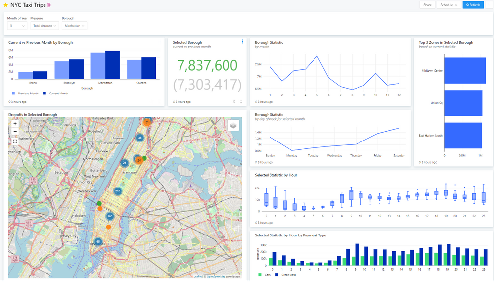
Figure 1 NYC Taxi Trips dashboard
This dashboard consists of multiple visualization widgets based on the month, borough, and measure selected in the dashboard level filters widget at the top of the screen. It uses source data derived from the NYC taxi data set, an open-source big data set of taxi trip records containing trip dates and times, pick-up and drop-off locations, fares, tips, tolls, and payment types. The goals defined for this dashboard were to compare a selected measure across boroughs, provide a variety of time-series comparisons of that measure for the selected borough, and show drop-off locations within that borough on a map.
There are several steps required to produce the NYC Taxi Trips dashboard:
- Data preparation. The raw data from the NYC taxi data set must be loaded into tables and then transformed, aggregated, and loaded into Databricks SQL tables.
- Query development. A query editor is used to develop queries and view execution results in table form. Some queries are used for data visualizations in the dashboard, while others are used as query parameters to filter the query results by month, borough, and measure.
- Visualization creation. A visualization is added to and saved with a query in the query editor. A query can have multiple visualizations.
- Dashboard design. After creating a dashboard, visualization and textbox widgets are added and arranged as desired on a design surface. If a visualization is associated with a query containing query parameters, the parameter can either be added as a dashboard level filter or restricted to the widget.
After the data preparation process was complete, Databricks SQL made it easy to try out an idea, see the results in a dashboard quickly, and fine-tune the query and visualization incrementally until I achieved the desired result. Let’s take a closer look at each of these steps.
Data preparation
As I mentioned above, the NYC taxi data set was used for this project and was prepared for me by my data engineer, John. The primary dataset we used is accessible on all Databricks workspaces as raw CSV files through a folder called databricks-datasets. However, it did not have borough or neighborhood data, which I thought would be important, so we also pulled in that data as well. Think of these datasets as belonging to the Scheduled Ingest process shown on the left-hand side of the architecture diagram shown in Figure 2.
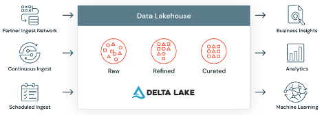
Figure 2 Delta Lake architecture
John ingested the datasets into Delta Lake tables and transformed them into one curated Delta Lake table (gallerynyctaxi.gold_summarystats) that I could then consume. To do this, he created a Databricks notebook, which is used for data engineering and data science. We had to collaborate on a couple of changes to the data, which worked out well because I could go into the notebook and watch as John made changes in real-time. I was also amazed at how fast Azure Databricks was able to reprocess the data after these changes.
Before explaining how I developed the queries, I want to take a moment to describe a Delta Lake table since this feature was also new to me. A Delta Lake table is an open table format that enables building a lakehouse architecture on top of my Azure Data Lake. At its core, a Delta Lake table is a set of parquet files, but it has a transaction log and features like ACID transactions that make it look and feel like a data warehouse table in Databricks SQL.
Query development
The process to develop queries for the dashboard visualizations is straightforward. You connect to a SQL endpoint, choose a database, and you’re set. You can use the schema browser to review the table structures and then write SELECT statements to explore the table contents. The user experience here is much like working in SQL Server Management Studio, except that you’re working in a browser instead of an application interface.
Query results are returned quickly and are saved with your query, making it easy to review your work later without re-executing the query. Another handy feature is the ability to revert to the previously saved version after you edit a query. The advantage here is that you can work quickly with your big data set to spend more time analyzing it instead of waiting for your queries to execute.
First iteration. For this project, the first iteration of query development focused on eight static queries to get the query results shaped correctly. These queries are similarly structured and represent a common theme in data analysis by grouping, aggregating, filtering, and sorting the data. Here’s an example of a query in the first iteration:
SELECT
  dropoff_date,
  dropoff_hour,
  count(1) AS measure
FROM
  gallerynyctaxi.gold_summarystats
WHERE
  borough_dropoff = 'Manhattan'
  AND date_part('MONTHS', dropoff_date) = 5
GROUP BY
  dropoff_date,
  dropoff_hour
ORDER BY
  dropoff_date,
  dropoff_hour
Use LIMIT instead of TOP. One point to note concerning the query that returns the top 3 zones in the selected borough, associated with the visualization shown in Figure 3. If you come from a Transact-SQL background, you would generally use the TOP and ORDER BY clauses in this type of query. However, in Databricks SQL, you use the LIMIT clause in combination with ORDER BY instead, like this:
SELECT
borough_dropoff, zone_dropoff,
COUNT(1) AS measure
from gallerynyctaxi.gold_boroughs
WHERE borough_dropoff = 'Manhattan'
AND date_part('MONTHS', dropoff_date) = 5
GROUP BY borough_dropoff, zone_dropoff
ORDER BY measure desc
LIMIT 3

Figure 3 Top 3 zones for Manhattan for May based on the trip count
Visualizations were created for each query and added to a dashboard during the first iteration to determine the best way to present the query results and start thinking about how the dashboard could be more dynamic. Details about creating visualizations and the dashboard are provided later in this post.
Parameterization. The tight linkage between a query, a visualization, and a dashboard allows you to move from idea to actualization smoothly and rapidly. For this project, the initial idea was to use parameterization to facilitate the analysis of individual boroughs. Later, as we added more data to the tables, we decided also to add parameters for both the month of year and the measure to be displayed in the visualizations.
A parameter value can be set by typing in a value or selecting a value from a dropdown list. If you choose to use a dropdown list, you can provide a static list of values or reference a query. Of course, the most efficient way to manage parameters across multiple queries is to establish a query for each parameter. Furthermore, using a query to populate parameter values allows the query to adapt to the current contents of the database dynamically. It’s important to make sure that the query contains only a single column of values.
The exception in this project was the list of measure names which is a static list that we placed into a query to facilitate reuse across multiple queries. That way, if any change would be needed later, only this query would require editing:
SELECT measure_name
FROM
(
SELECT 'Trip Distance' AS measure_name
UNION
SELECT 'Total Amount' AS measure_name
UNION
SELECT 'Fare Amount' AS measure_name
UNION
SELECT 'Tip Amount' AS measure_name
UNION
SELECT 'Tolls Amount' AS measure_name
) AS t
ORDER BY measure_name
The query for a drop-down list must exist before a query parameter is configured. You create this query in the query editor, just like any other query, and assign it a name.
Second iteration. The second iteration of query development incorporated the addition of the three query parameters into most dashboard queries. In some cases, only two parameters were required because a query either focused on all boroughs in a given month, as shown in Figure 4, or on all months for a given borough, as shown in Figure 5.
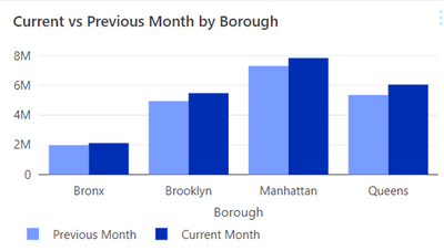
Figure 4 All boroughs for the selected and previous month
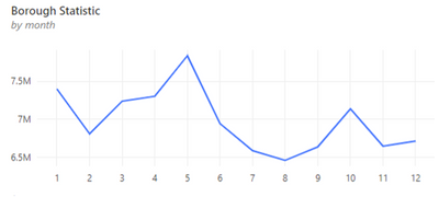
Figure 5 All months for the selected borough
Adding a query parameter is a two-step process. First, you add the query parameter to the query, and then you configure its values. To add the query parameter to the query, you provide a name for it and enclose that name in double brackets. For example, to create a query parameter named Measure, you insert {{Measure}} into the query. You can use the query parameter in conditional logic operations in the SELECT clause or the WHERE clause, as shown here:
SELECT
dropoff_date,
dropoff_hour,
CASE
  	WHEN '{{Measure}}' = 'Trip Count' THEN COUNT(1)
  	WHEN '{{Measure}}' = 'Trip Distance' THEN SUM(trip_distance)
  	WHEN '{{Measure}}' = 'Total Amount' THEN SUM(total_amount)
  	WHEN '{{Measure}}' = 'Fare Amount' THEN SUM(fare_amount)
  	WHEN '{{Measure}}' = 'Tip Amount' THEN SUM(tip_amount)
  	WHEN '{{Measure}}' = 'Tolls Amount' THEN SUM(tolls_amount)
  ELSE 0 END AS measure
FROM gallerynyctaxi.gold_summarystats
WHERE
borough_dropoff = '{{borough}}'
AND date_part('MONTHS', dropoff_date) = {{Month of Year}}
GROUP BY dropoff_date, dropoff_hour
Notice that when a query-based parameter value is text, like {{Measure}}, single quotes must also enclose it, whereas an integer query-based parameter, like {{Month of Year}}, does not use quotes. On the other hand, if a parameter value can be entered by the user (and not based on a query), and you specify the type as Text, you do not need to enclose the query parameter in single quotes.
Query parameters. The addition of the query parameter into the query triggers the addition of a widget, shown in Figure 6, above the query results table in the query editor. Click the gear icon next to a parameter widget to configure its type. You can choose from Text, Number, Date, Date and Time, Date and Time (with Seconds), Dropdown List, and Query Based Dropdown List. If you choose either of the latter two types, you have the option to allow the user to select multiple values from the list.

Figure 6 Query parameter widget
When choosing the Query Based Dropdown List type, you select the query to associate with the parameter. When you click in the box to select a query, a set of available queries is presented for selection, but you might not see the query you need in this list. If that’s the case, just type a few letters of the query name, and the list is filtered based on this search.
After you configure the query parameter, you’re ready to use it. However, you must supply a value in the parameter widget before you can execute the query.
Visualization creation
Once a query has been executed successfully, you can immediately add one or more visualizations in the query editor. The visualizations are accessible in the results section of the editor as an additional tab and saved with the query, just like the table results, as shown in Figure 7. Whenever you change the query or query parameter values and re-execute the query, the table and visualization results are updated so you can see the effect of changes right away without changing tools.
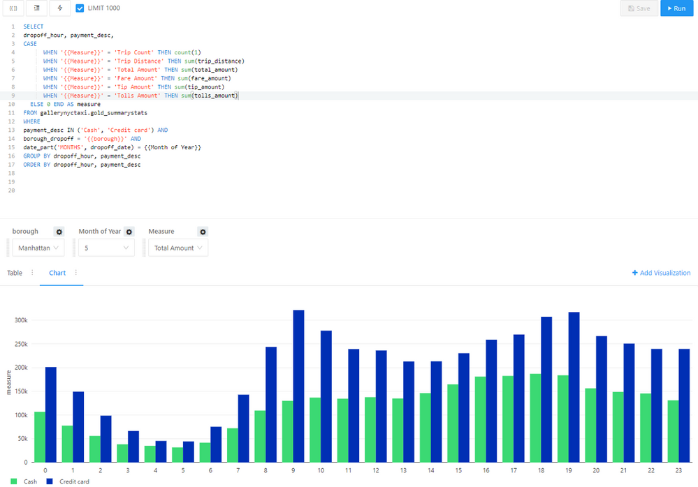
Figure 7 Visualization results in the query editor
Databricks SQL provides various visualization types, ranging from the typical types, such as bar and line charts, to other visualization types less commonly encountered, such as funnel or sunburst charts. Because the goal of this project was to facilitate comparisons and to show trip activity using geolocation data, we decided to use the following five types of visualizations:
- Bar chart. A bar chart is a helpful visualization for making comparisons, whether across a category, such as borough, or across time, such as hours of the day. With the bar chart visualization in Databricks SQL, you can choose vertical bars (also known as a column chart in other tools), horizontal bars, or add a series (to create a clustered column chart).
There are three bar charts in the dashboard shown in Figure 1. The Current vs Previous Month by Borough chart in Figure 4 compares boroughs for the selected statistic, Total Amount in this case. It allows the viewer to see how the measure varies across boroughs and from the selected month of May to the previous month of April.
The Selected Statistic by Hour by Payment Type in Figure 7 is similarly structured but compares cash versus credit cards as payments over hours of the day.
The Top 3 Zones chart in Figure 3 uses horizontal bars to emphasize a comparison of the zones within a borough having the highest values for the selected statistic. - Counter. A counter can simply display a single value or a key performance indicator (KPI) value compared to a target value. In the latter case, if the KPI value is greater than the target, the value displays using a green font. A KPI value lower than the target displays using a red font. There is no option to format these font colors differently.
In the dashboard, the Selected Borough visualization, shown in Figure 8, is a counter that displays the value for the selected statistic, Total Amount, for the current month of May for Manhattan. The green color indicates this value is greater than the previous month of April, shown in parentheses below the current month’s value.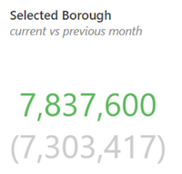
Figure 8 Counter
Line chart. A line chart helps the viewer see how data changes shape over time, the category placed on the X-axis. Line charts can also enable a comparison of series across time by using different colored lines.
The dashboard makes use of two line charts. The first, in Figure 4, shows the selected borough’s statistics over 12 months, highlighting the peaks and valleys of taxi revenue over a year. The other line chart, shown in Figure 9, shows similar information for days of the week for the selected month, which in this case is May, and again emphasizing the variation in revenue patterns from day to day.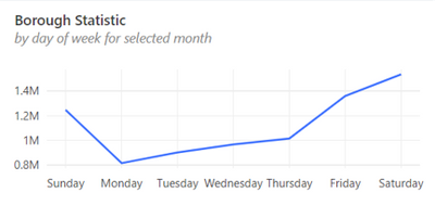
Figure 9 Line chart
Box plot. A box plot is an effective visualization used to present multiple summarized data points and helps analyze distribution across categories. Each box represents five summary statistics: minimum, first quartile, median (also known as second quartile), third quartile, and maximum.
We added Selected Statistic by Hour as a box plot (shown in Figure 10) to the dashboard to compare the summary values for the selected statistic across hours of the day for the selected borough and month. This type of visualization allows the viewer to easily see at which times of the day there is a greater range of values as compared to the median and see whether the data is distributed normally or skewed positively or negatively.
Figure 10 Box plot
- Map. When you have geolocation data, it can be helpful to plot that data on a map to see trends by location. The Databricks SQL map also allows you to create groupings of data points to enable comparisons on the map.
The map (shown in Figure 11) in the dashboard shows clusters of trips by dropoff location within the selected borough. As you zoom in on an area of the map, you can see an increasing level of detail, both in the map itself as well as where the data points are plotted. The grouping in the map is defined as the number of trips, with most drop-offs at locations associated with a single trip. The data includes instances of two or three trips to a single location that are easily distinguishable from the single-trip dropoffs by using different colors.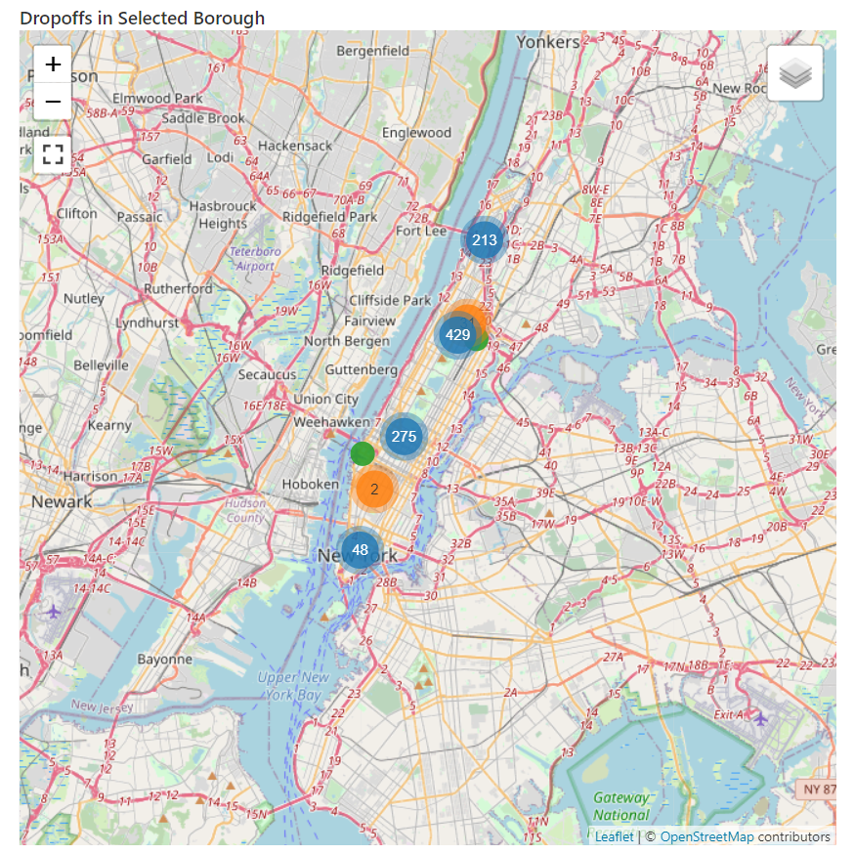
Figure 11 Map
Each type of visualization has a set of properties that you can configure to produce a particular look and feel, including legend placement, colors, data label formatting, and support for both left and right Y axes. Some visualizations have properties unique to their type, such as bubble size properties for a bubble chart. As you make changes to a visualization’s property inside the Visualization Editor, you can see the effect of that change right away.
Creating a bar chart. Let’s take a closer look at the steps required to produce a bar chart, such as the one shown in Figure 6. After the query successfully executes, you click the Add Visualization button to open the Visualization Editor.
Your first step is to select a value in the Visualization Type dropdown list. Optionally, you can give the visualization a name. This name displays in the visualization tab in the query editor and is the name used by default when you add it to a dashboard. However, you can override this name in the dashboard later if you like.
Then configure the properties, beginning on the General tab. You select the specific type of chart you want to use in the Chart Type dropdown list. In this case, you use Bar, but your other choices include Line, Area, Pie, Heatmap, Scatter, Bubble, and Box. Then there’s a checkbox if you want to convert the bar chart to horizontal bars.
Next, you select the columns to display along the x- and y-axes, dropoff_hour and measure, respectively, in this chart. You can specify a Group By column optionally, which adds a series to the chart. Here you use payment_desc as the grouping column. The Legend Placement property defaults to a position to the right of the chart, which you can move only to the bottom, as we did for this chart, or hide it if you don’t want to display it at all. After the general properties are configured, the chart appears, as shown in Figure 12.
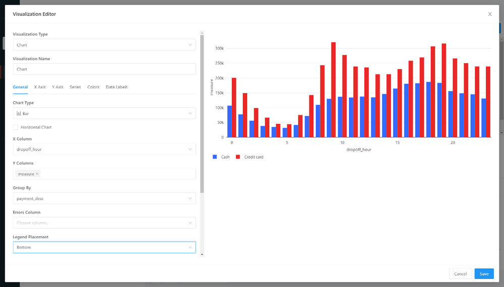
Figure 12 General page of the Visualization Editor
Configuring visualization properties. Although this chart conveys the correct information about the data at this stage, we thought we could improve the appearance of the dashboard in the following ways:
- Allocate more screen space to the visualization by removing the axis titles and instead use the widget title in the dashboard to convey the meaning of the axes.
- Display each label on the x-axis so the viewer doesn’t have any difficulty discerning the hour of the day associated with each column.
- Apply a different color scheme to the series data, using green for cash and a darker blue for credit card.
To achieve the first two of these objectives, go to the X Axis tab and remove the default name, which by default is the name of the column placed on this axis. Then select Category in the Scale dropdown list to add the labels to each column. There are toggle switches on this page which by default sort the label values and display the labels on the axis. There are two other toggle switches here that are disabled by default, Reverse Order and Hide Axis.
Moving on to the Y Axis tab, all that is necessary is to remove the default name. Optional properties allow you to configure a minimum and maximum value for the y-axis, define a different scale type such as logarithmic, or set up a right y-axis.
For the third objective, go to the Colors tab. Here you use a color picker to override the colors automatically assigned to the visualization. The color picker offers a choice of twenty colors, or you can type in the hex color code if you need a specific color not shown. After editing the properties, click Save, and the visualization is ready to add to a dashboard.
Dashboard design
When a dashboard is created, it consists of a blank design surface. Here you add widgets to provide content for the dashboard. Databricks SQL supports two types of widgets—a visualization and a textbox.
You can start adding visualizations to the dashboard by clicking the Add Visualization button and then searching for the visualization’s query by name. You then choose which of the query’s visualizations to display, or you can even choose to display the query’s results table. As an alternative, there’s an Add to Dashboard command available in the query editor that allows you to link the current visualization to an existing dashboard that you search for by name.
You can also add textbox widgets to the dashboard to annotate the visualizations using basic Markdown syntax. You can even place a static image inside a textbox using Markdown’s image element.
Dashboard parameters. If a visualization’s query has parameters, you must decide how to display the parameters in the dashboard. For example, when adding the Selected Statistic by Hour by Payment Type chart to a dashboard, the Add Visualization Widget dialog box, shown in Figure 13, lists the parameters by name and shows the keyword used in the query for each parameter. The default value defined in the query editor is shown but is not editable here.
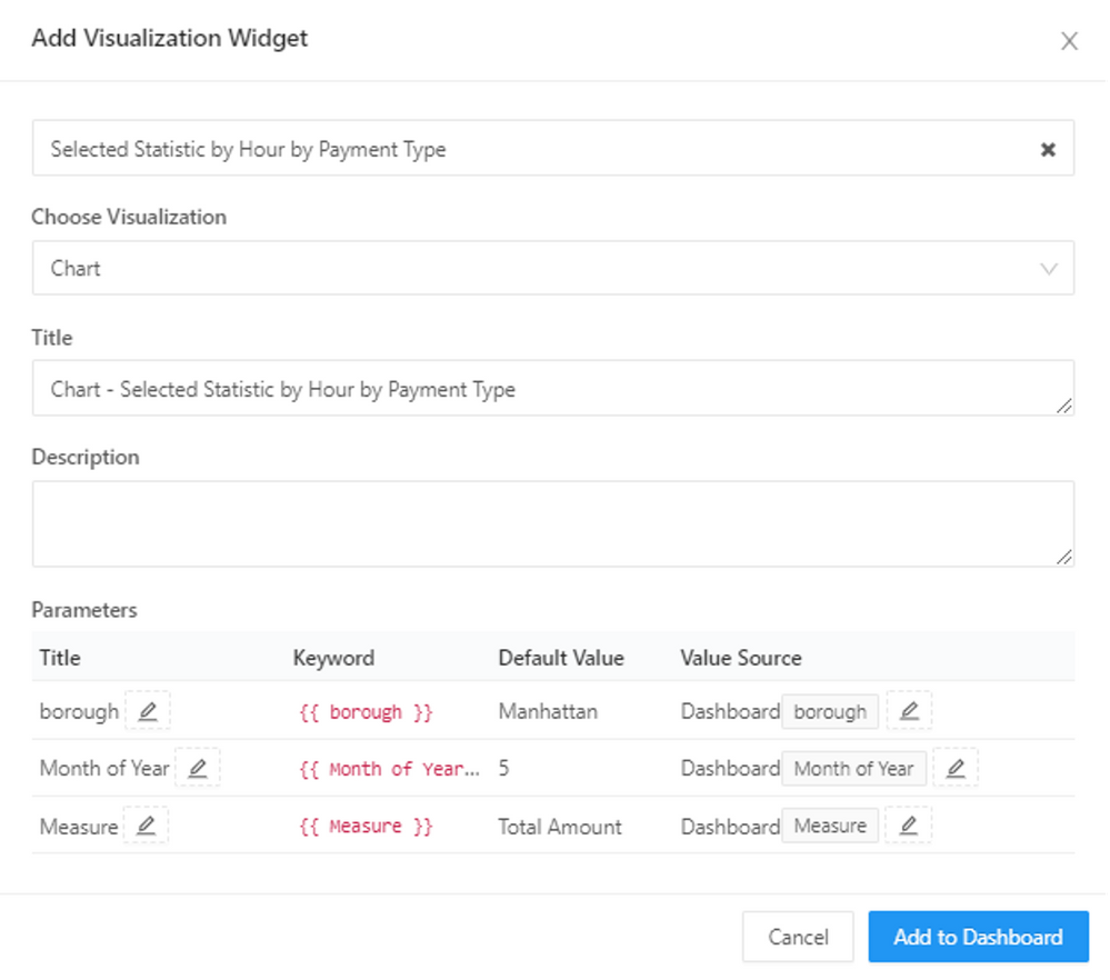
Figure 13 Add Visualization Widget
Notice that Value Source defaults to Dashboard, which means the parameter will be assigned at the dashboard level. Any other visualizations that you subsequently link to the dashboard parameter will use the same value. You can click the pencil icon to the right of the Value Source name to edit the parameter name to display in the dashboard or change the source. You can either set a static value that hides the parameter and prevents a user from changing it or set the source to the widget and require a user to set a parameter value separately for that visualization.
This ability to control whether parameters affect a single visualization only or multiple visualizations is conceptually like setting visual-level or page-level filters, respectively, in Power BI. However, in Power BI, you’re setting up the visuals filters, adding a filter, and deciding as you add it how the filter applies—visual, page, or report. Instead, in Databricks SQL, the query parameter is part of the visualization already. When you add the visualization to a dashboard, you’re deciding whether the control of that parameter is at the dashboard level or the widget level. And just because a parameter is defined at the dashboard level, it does not necessarily apply to every visualization contained in the dashboard. If you’re not careful with your parameter configuration, this capability has the potential to cause confusion. On the other hand, it does give you greater flexibility that might be useful in some scenarios.
Query filters. It’s also important to note that a query parameter is similar to, but not the same as, a query filter which is not being used in this dashboard project. If you were to use a query with a filter, you must enable the Use Dashboard Level Filters property in the dashboard to ensure the filter applies to all queries used by the dashboard.
Adjusting widget location and size. After adding multiple visualizations to the page, you can rearrange and resize the widgets using drag and drop. There is a limit to how small you can make a widget, affected in part by the widget’s content, so experimentation is required to determine the best sizing. Likewise, the width of any single widget is restricted to the width of the browser page.
As the dashboard designer, you can quickly return to the query editor for any visualization if you need to make some edits or simply want to review the construction of the query or its tabular results. Each visualization contains a menu button that includes a View Query command. This option is not available by default to other users with whom you share the dashboard, however. If you want others to open the visualization’s query editor, you also need to share its query, and you will need to do this query by query as there is no blanket sharing option for all queries linked to a dashboard.
Conclusion
After building and refining the NYC Taxi Data dashboard, my overall impression of Databricks SQL is favorable. It provides an excellent alternative option for exploring big data without the need to download and install dedicated tools or learn traditional big data languages. It’s not intended to be a replacement for your existing business intelligence tools. Instead, it fits into your existing architecture as a browser-based option available for ad hoc exploration of new datasets, as well as supporting tight integration for Power BI workloads. On the other hand, it’s certainly capable of supporting much more of your data analytics needs.
Databricks SQL fulfills its promise of being easy to use and delivers great performance. Queries are easy to create and execute, and results against big data sets are pretty fast. I could experiment with various visualization types and then add them to a dashboard with just a few more clicks. Then I could extend the usefulness of the dashboard by adding parameters to the queries to display the data from multiple perspectives. In addition to the native query and visualization tools, Databricks SQL provides support for all of your existing Power BI workloads. Setting up reliable connections to data lake tables is simple, and you can integrate your existing authentication solution.
Ready to get started with Databricks SQL? Just bring your SQL query skills. There’s no new language required!
Brought to you by Dr. Ware, Microsoft Office 365 Silver Partner, Charleston SC.


Recent Comments