This article is contributed. See the original author and article here.
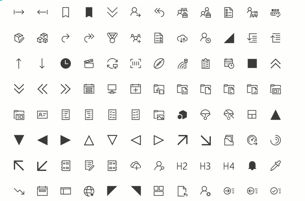
Power Apps offers you a variety of icons – and recently, there were nice additions announced and rolled out. But if we want to create even more appealing apps, it makes sense to extend our pretty little icon library. Microsoft provides us with Fluent UI.
Fluent UI is a collection of UX frameworks for creating beautiful, cross-platform apps that share code, design, and interaction behavior
One part of Fluent UI is the iconography

How to get Fluent UI icons
You can browse through the icons in the Fluent UI icons tool, but there is right-click download option. As a developer, you can import Fluent UI iconography (and more) into your applications; for Power Apps, there a different way how to use them:
Use a community-driven tool to import icons to Power Apps
there are several tools available to get Fluent UI icons into Power Apps; find two of them here:
However, if you only want to use a few specific icons for an app or would like to try them out, you can head over to the Fluent UI repository on GitHub and right-click-download the icons. After that, you upload them to your Power App and can use them like any other image. Super cool: You get all icons as .svg files, which have three significant advantages:
.svg are transparent, which means you have no extra work to remove any background
.svg are lossless scalable, which means that you blow them up as you like it
.svg have are usually smaller than .jpg files of the same quality – this will have an excellent effect on the performance of your app
Pop-Ups
Screens in Power Apps are perfect for displaying information that should always be shown. But what if we only want to show some more content occasionally? Pop up to the rescue!

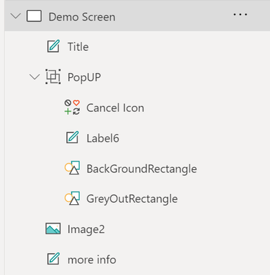
To create a pop up effect, create:

a rectangle that overlays the content that our user now should not focus on – good idea to have it filled grey and semi-transparent
a rectangle, smaller than the GreyOutRectangle, filled in in brighter background-color
a text label which shows the information
a cancel icon
Group these controls; it’s easier to work with them then.
Now create a textlabel (or a button, or an image… something that our user will click on to see the pop up).
Set the .onSelect property of this label to
UpdateContext({isShowPopUp:true})
Set the .onSelect propert of the cancel icon to
UpdateContext({isShowPopUp:false})
Set the .visible property of the whole PopUp Group tp
isShowPopUp
This way, we set the isShowPopUp variable to true, if the user clicks the label, which will make the PopUp visible. As soon as the user clicks the cancel icon, the isShowPopUp variable is set to false, which means that the group will not be shown anymore!
Create an expand- and collapse able menu
As we need to deal with all screen estate carefully, it is a fantastic idea to have a menu that can expand and collapse. To create this, we need
a collection that holds the screens that we want our users to allow to navigate to
a gallery, which displays the items of our collection
a Hamburger Menu icon, which sets a variable to control the width of the gallery
- collection
To have icons (which will show while the menu is collapsed) and text (that will show up right next to our icons when the menu is expanded), we will first upload a few svgs (see above) and then refer to them in our collection:
ClearCollect(

NavigationMenu,

{

Row: 1,

Title: "About",

Image: ic_fluent_lightbulb_24_regular

},

{

Row: 2,

Title: "Flights",

Image: ic_fluent_airplane_take_off_24_regular

},

{

Row: 3,

Title: "Hotels",

Image: ic_fluent_bed_24_regular

},

{

Row: 4,

Title: "People",

Image: ic_fluent_people_32_regular

}

)

)
- Gallery
We create a gallery and set the .items property to our collection
We set the .width property to If(!IsExpand, 200, 50) or similar – first value is the expanded width, second is the non-expanded (collapsed) width.
As we want to pretty things up a little bit,
add a small rectangle to your gallery
add a rectangle (width = 1) to the right of your gallery
- Hamburger menu
we add a hamburger menu icon and set its .onSelect property to Set(IsExpand, !IsExpand)
- adjust all other controls on the screens
Now work on the .X property of all labels, buttons, images, etc. Set it to
If(!IsExpand, <original value>,<originalvalue>-150)
Our result should look something like this:

Feedback and what’s next?
What are your little tricks to make apps look more beautiful? I am curious to learn from you! Please comment below!
Brought to you by Dr. Ware, Microsoft Office 365 Silver Partner, Charleston SC.


Recent Comments