This article is contributed. See the original author and article here.
Intro:
Visualizing your data is a great way to gain insight and quickly learn what you need from your logs.
We have improved our chart tab in Log Analytics offering a new way to control your visualization making it easier for you to reach the exact visualization you need.
The new control pane:
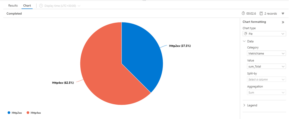
The new control pane for visualization is located to the right hand side of the visual:
The new pane offers a clean, modern look and offers a more intuitive way to manage your visual.
The new pane may also be collapsed to allow focus on the visualization and save screen real-estate.
Feedback
We appreciate your feedback! comment on this blog post and let us know what you think of the new visualizations control pane.
Brought to you by Dr. Ware, Microsoft Office 365 Silver Partner, Charleston SC.

Recent Comments