
by Scott Muniz | Jul 16, 2020 | Azure, Microsoft, Technology, Uncategorized
This article is contributed. See the original author and article here.
There’s no question that online marketplaces have transformed how people buy and sell goods online. But they’ve also helped transform the way services are rendered, creating an on-demand work environment—AKA the Gig Economy—that lets individuals and organizations engage or contract with independent workers for short-term projects and services.
This independent workforce is a growing trend, and it’s larger than you might think. McKinsey estimates 20-30% of workers in the US and EU already engage in independent work. Despite current economic upheavals, this trend is expected to grow. Online marketplaces are expected to have a transformative impact by connecting pools of talented freelancers with businesses that need them, providing a secure platform to source, hire, and pay for projects.
That’s why I’m excited to share we’re partnering with Upwork, the leading online marketplace connecting freelancers with businesses. Together we’ll provide easy access to a curated talent pool of Microsoft Azure experts. Upwork has ensured these freelancers have proven performance, and Microsoft has verified these individuals hold current Microsoft Azure certifications at the associate or expert level. With the extended backend verification, prospective hirers can have confidence those bidding on their projects have proven expertise.
Meet a few of the Azure certified freelance experts available to support your projects:
 Hardik Mistry
Hardik Mistry – A two-time Microsoft MVP, Hardik has over a decade of software engineering experience. He has designed and implemented cloud native solutions for start-ups and large Fortune 500 brands. Hardik is the founder of AppMatic Tech, a full-service software development agency. In his free time, he serves as a mentor for open source software professionals and community user groups.
 Amos Cabanban
Amos Cabanban – A Microsoft Certified Azure Solutions Architect Expert, Amos is a top-rated freelancer with nearly 10 years of experience working on Upwork. As a tenured .NET consultant, he has supported client projects across a wide range of industries including healthcare, energy, real estate, technology, legal, banking and manufacturing.
 Cedric Pomerlee
Cedric Pomerlee – A Microsoft Certified Azure Administrator Associate, Cedric has over 8 years of IT engineering and architecture experience supporting companies ranging from SMBs to large Fortune 1000 organizations.
 Jen T.
Jen T. – A Microsoft Certified Azure Developer, Jen has over 12 years of experience leading web application development with expertise in C#, ASP.NET and JavaScript. She has a proven track record of success helping companies evaluate their current systems to uncover problems and implement solutions the meet customer and business requirements.
Small and medium size businesses have been quickest to embrace this method of finding talent. However, businesses of any size can increase the pace of innovation by engaging the needed expertise, on-demand as projects come up.
We expect this to a be a great talent pool complement for our existing partners and customer alike. If you’d like to tackle your next Azure project quickly, visit Upwork to find a Microsoft certified freelancer. If you have Azure expertise and would like to participate as a freelancer, sign up now.
by Scott Muniz | Jul 16, 2020 | Azure, Microsoft, Technology, Uncategorized
This article is contributed. See the original author and article here.
Within the world of security operations, dashboards and visual representation of data, trends, and anomalies are essential for day to day work. In Azure Sentinel, Workbooks contain a large pool of possibilities for usage, ranging from simple data presentation, to complex graphing and investigative maps for resources. Out of the box, Sentinel already comes with dozens of Workbooks. It also allows for custom workbooks to be created based on the user’s vision and use case. The purpose of this blog is to provide examples and describe some of the more advanced uses for Workbooks in Sentinel. We have also created a sample Workbook that can be accessed here that can be used to follow along.
If you would like to watch a presentation on the uses of Workbooks, you can check out our Security Community webinar on this topic here.
Pre-requisites:
- Azure Sentinel Contributor permissions
- Azure Workbooks Contributor permissions
- Available data in your Azure Sentinel/Log Analytics workspace
Before we can dive into the advanced topics, it is important to recap the basics.
- Text – simple text or comments on the workbook
- Grids – a row by row view of data
- Graphs – visual representation of data in comparison
- Time Charts – visual representation of data over time
Advanced
- Power BI – move data to Power BI for dashboarding
- Tabs – separate data by topic per tab
- Groups – grouping of tiles by topic
- Time Brushing – selecting a window of time for logs
- Hives – visual grouping of data into hive shapes
- Dynamic Content – enabling tiles to inherit variables based on other tiles
- Personalization – modify results in the Workbook to standout or be presented differently
Text

Text within a workbook is a simple section where text can be added to describe data, leave comments, instructions, and more. The purpose of this is to allow for user input to be listed on the workbook. Text can be used to help maximize the effectiveness of visuals by noting important areas to check, procedures to follow, or items to keep an eye out for. An example would be adding a note in text near a time chart to watch for over 100 failed login attempts.
To deploy text:
- Go to your Workbook.
- Hit ‘Add’ and choose ‘Text’.
- It will open a new section for text to be input.
- The font size can be modified to show titles, notes, and descriptions.
- Click ‘Done’ when finished.
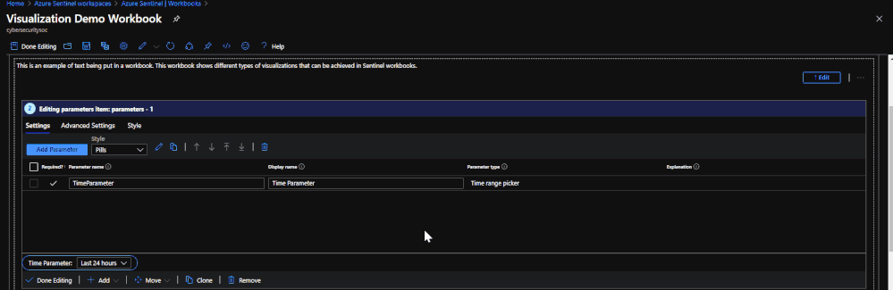
Parameters
 Changing the parameter value will change the range for all items that are configured to use the value.
Parameters allow for the selection of values that will be applicable to the whole Workbook. This can be used for time ranges, subscriptions, workspaces, filtering, and more. The parameters are presented as a drop-down list which can be placed at the top of the Workbook or just above graphs. Each selection can provide impact on which data is presented or how it is queried.
To deploy parameters:
- Click ‘Add’ and choose ‘Parameter’.
- Give the parameter a name.
- Click ‘Edit’ and choose ‘Settings’.
- Within Settings, the parameter type can be chosen and the value options for selection can be set.
- Click ‘Save’ when finished.
*Note: If the parameter has a ‘!’ by it, the value has not been set and needs to be done.

Grids

Grids are where logs and other data items are listed in a rowed fashion. This is where data that is queried is listed. This data is what can be transformed into graphs, time charts, hives, and more. Each grid is made up of a Kusto query that runs when the Workbook is accessed. The queries can range in time, data tables, etc.
To deploy grids:
- Go to ‘Add’ and choose ‘Query’.
- Enter a query for the data that you would like to pull.
- The results will get capped at 250 so if you do not want too much, make sure to use the ‘take’ operator to limit the amount of rows you want returned.
Graphs and Charts

Graphs are a type of visual representation for data in Workbooks. These can vary between pie graphs to bar graphs. This is how data is visualized to show trends, comparisons, and more. These visuals can assist with finding potential malicious events, unhealthy trends, or outliers in performance.
To deploy graphs:
- Go to ‘Add’ and choose ‘Query”.
- Enter a query and make sure that there is a summarize count() or count() that is used within the query. The data cannot be put into a graph format if there are not numeric values for the subjects in the data.
- Use either the ‘render’ operator or choose ‘Visual’ in the query settings within the Workbook to choose the graph that it will be displayed as.
*Example query*

SecurityAlert
| where TimeGenerated >= ago(30d)
| summarize count() by ProviderName
| render barchart

Time Charts

Time charts are similar to line graphs but lay out more information and focus more on a time frame of information. This ties into tracking anomalies, unhealthy trends, and more. This also ties into time brushing in the advanced section. Similar to regular graphs, the query option must be chosen. This time around, the query will need a ‘bin’ operator. The bin operator will take a variable and a time scale value and create a series based on the data.
An example would be ‘summarize count() by ProviderName, bin(TimeGenerated, 1d)’. This is taking a count of ProviderName from the query results and generating a time series that will show the amount of results per day.
SecurityAlert
| where TimeGenerated >= ago(30d)
| summarize count() by ProviderName, bin(TimeGenerated, 1d)
| render timechart
Tabs

Tabs are headers within the Workbook that can be selected in order to change what is being presented on the page. This is very useful when making a Workbook that might cover several topics or if there is a large amount of information to present.
To deploy a tab:
- At the top of the page click ‘Add’ and choose ‘Tabs’. Each title will need to be made.
- Give the new item a title and choose actions – ‘Set a parameter value’.
- Set the value to ‘Tab’ and give the tab a value that identifies what it is for.
- If you would like certain tiles to be mapped to specific tabs, you must go to ‘Advanced Settings’ on the item and enable ‘Make this item conditionally visible’.
- Set the value to be ‘Tab equals (the value of the tab you set)’. The item will no longer show on other tabs until the proper tab has been chosen.
Groups
Groups allow users to set tiles, graphs, and other data into collections based on topic, format, and more. The best use for groups is distinguishing data types or topics from each other and separating them. This can be maximized by using tabs to separate each group into different tabs.
To deploy a group:
- Go to ‘Add’ and choose ‘Groups’.
- Groups can have countless tiles and items added to it. If you would like to add existing items to a group, choose ‘Move’ and choose the group you want to move the items to.
- If you would like the group of items to show up under certain tabs, add a condition stating that it will only show if a certain value is chosen.
Time Brushing

Time brushing is the ability to click and drag on a time chart to set a time window that should be investigated. By using time brushing, tiles and logs that follow the time chart can inherit the time range chosen to narrow down associated information.
To set up time brushing:
- ‘Enable time range brushing’ must be enabled under the advanced settings of the time chart.
- From there, the time range will need to be changed to the new time variable you created in the previous step.
- Once set, click and drag on the time chart to change the range.
- For items within the Workbook to inherit the new time range value, change the time to be the value that you created in the time chart.
Hives

Hives utilize a new visual feature that is in preview within Workbooks. Hives allow you to use a graphical interface that can be moved or modified while presenting data in a compact, hive layout. This new graphing feature, outside of hives, allows for a more interactive graphing/mapping functionality.
To deploy hives:
- Click ‘Add’.
- Choose ‘Query’.
- Enter your query.
- Under visualize, choose ‘Graph’.
- Choose ‘Graph Settings’.
- Under layout settings, choose ‘Hive Clusters’.
- Set your remaining settings for size and color.
- Click ‘Save and Close’.
Dynamic Content
 The content will not appear until a resource is chosen.
Dynamic content allows you to export a selected variable to other parts of the Workbook. An example of this is selecting one machine from a list of machines and the other logs and charts throughout the Workbook now pertain to data for only that one machine. This is useful for narrowing down potentially compromised machines or machines of interest for anomalies.
To configure dynamic content:
- Set up a grid that contains results for which you would like to focus on.
- In the advanced settings for the grid, select the option ‘When items are selected, export parameters’.
- Give the item a name.
- Make sure to establish the item in the query that you are running so that it has a value for exporting.
- Set up a second grid or object that you would like to inherit the value from the selected resource in the first grid.
- Establish a variable to inherit the value from the item.
- Use the ‘dynamic’ operator to call the item you established in the first grid as this is how the second grid will see the exported value of the item.
- Establish a clause in the query in the second grid to limit the results to the information that is tied to the variable with the inherited value.
*Set up the variable to take on a value*

SecurityAlert
| extend Resource = ResourceId
| summarize count() by Resource
| sort by count_ desc

*Set up a variable to inherit the exported value of the selected object*

let Resource_ = dynamic({Resource});
SecurityAlert
| where ResourceId contains tostring(Resource_)
| project TimeGenerated, Resource_, AlertName, AlertSeverity, ProductName

Personalization:
Personalization allows users to modify the results and look of grids and charts to suit their use cases, as well as improve the Workbook experience. An example of a Workbook personalization would be to add color coding for severity of alerts in grids or charts (i.e. red for high severity, green for low severity), or changing a URL link from text to being a clickable URL.
To personalize a Workbook:
- Find a grid or chart that you would like to modify.
- Click ‘Edit’.
- Go to ‘Column Settings’.
- Look over all of the settings to see what there is to change and test how it will look.
- Click ‘Save’.

Power BI
An alternative to using Azure Sentinel workbooks is to use Power BI. This is Microsoft service that allows you to export queries and results from Log Analytics to Power BI for reporting purposes. You may already be using Power BI for reporting in other parts of your business, as it supports reporting from a wide number of sources.
To use Power BI, it must be done from the Log Analytics workspace:
- Choose a query that would like to export and run it.
- In the top right, choose ‘Export’ and choose ‘Export to Power BI (m query)’.
- A file will be generated for Power BI, use the query in the file in Power BI for reporting in the Power BI portal.
- Within the Power BI portal, choose ‘Get Data’ and select ‘Blank Query’.
- Select ‘Advanced Editor’.
- Paste the query from the text file in the editor.
- Publish to Power BI.


What’s next?
We have prepared a sample Workbook that displays each item that was covered in this blog. The purpose of this Workbook is to assist users in seeing examples of each item, how they are configured, and how they operate. The goal is for users to use this Workbook to learn and practice advanced topics with Workbooks that will contribute to new custom Workbooks.
To deploy the template:
- Access the template in GitHub.
- Go to the Azure Portal.
- Go to Azure Sentinel.
- Go to Workbooks.
- Click ‘Add new’.
- Click ‘Edit’.
- Go to the advanced editor.
- Paste the template code.
- Click ‘Apply’.
by Scott Muniz | Jul 16, 2020 | Azure, Microsoft, Technology, Uncategorized
This article is contributed. See the original author and article here.
I’m happy to announce that our friends (and AMS ninjas) over at SOUTHWORKS recently completed a comprehensive suite of Azure Media Services interoperability tests for Video.js and Shaka player, two of the most popular alternatives to the Azure Media Player (AMP) for live and on-demand streaming of hosted video.
We’ve released the resources, tests scripts and the results in a GitHub repository here –https://github.com/Azure-Samples/media-services-3rdparty-player-samples
The project repository contains:
- A platform/browser feature table for video.js and Shaka player frameworks for both HLS and MPEG-DASH delivery from Azure Media Services (AMS) that covers virtually every playback function, including popular DRM and Media Services live transcription service (using IMSC1 in MPEG part 30).
- The PowerShell setup scripts and full documentation needed to generate content (VOD and Live) in Media Services along with the tools SOUTHWORKS used to test the video.js and Shaka players in a myriad of different combination of features, streaming formats, and content protection from Azure Media Services.
- Sample implementations of the video.js and Shaka player ready to use with captioning and content protection (DRM and Encryption) already configured.
- Documentation on how to implement your own players
In the following video, Julian Faiad (GitHub: juliMatFa-SOUTHWORKS) of SOUTHWORKS provides an overview of how to use the project, setting up and testing the players.
We hope you find the test results, documentation, and player samples useful. We are making plans to test other 3rd party players in the near future, and we are open to contributions from developers of other player frameworks (commercial or open source) that would like to test their content with Media Services and validate it against the same test criteria. Please let us know what you’d like to see tested next.
John Deutscher
by Scott Muniz | Jul 16, 2020 | Azure, Microsoft, Technology, Uncategorized
This article is contributed. See the original author and article here.
Azure Data Factory announces the immediate public availability of Azure Data Factory Managed Virtual Network as pubic preview!
With this new feature, you can provision the Azure Integration Runtime in Managed Virtual Network and leverage Private Endpoints to securely connect to supported data stores.
Your data traffic between Azure Data Factory Managed Virtual Network and data stores goes through Azure Private Link which provides secured connectivity and eliminates your data exposure to the public internet. With the Managed Virtual Network along with Private Endpoints, you can also offload the burden of managing virtual networks to Azure Data Factory and protect against the data exfiltration.

To learn more about Azure Data Factory Managed Virtual Network, visit the Azure Data Factory documentation page.
To sign-up for the preview, please complete this form.
by Scott Muniz | Jul 16, 2020 | Azure, Microsoft, Technology, Uncategorized
This article is contributed. See the original author and article here.
IoT is almost always associated with NoSQL database. This is quite understandable as its flexibility and specialization are great for ingesting IoT data. But what if that flexibility and performance are also available in Azure SQL? That would make Azure SQL a perfect target for IoT data as along flexibility and performance you have security, manageability, analytics, and scalability. In this episode, Davide Mauri discusses all this and more – and shows you why Azure SQL is a great option for IoT and HTAP.
Watch on Data Exposed
Additional Resources:
Azure IoT reference architecture
Streaming At Scale – Azure SQL
Ingesting 10K events/sec Video
JSON Performance in Azure SQL
View/share our latest episodes on Channel 9 and YouTube!

Recent Comments